
Behind the scenes: illustrating impact for Ethos Pathways
A little recap of my most recent illustration project for Ethos Pathways.

What I love about illustration is that it is more than just producing beautiful art — it is a form of communication that conveys values, sparks interest, and engages our collective imagination. And getting to create illustrations for folks who are doing impactful work out in the world is always inspiring and a fun challenge.
Enter my friend Lani, founder of Ethos Pathways: a youth climate justice organization based in the Berkshires, MA. Ethos Pathways guides high school students towards finding their career path, recognizing that each student’s goals, needs, and circumstances are different and unique. This Spring, Lani reached out to see if I would be interested in helping her launch a new website for the program. I said yes! I brought on my friend and creative extraordinaire Hyde who served as the creative director and website designer for the project, while I tackled creating custom illustrations. With time ticking towards a June launch date, we dove into the project.
Having fun with character design
To begin, I wanted to gain a better understanding of the audience and how the illustrations could guide the digital experience. Over the course of several collaborative brainstorming sessions, we landed on depicting several student characters and how they might move through the program.
The rule of threes emerged naturally — three student characters, representing the three counties in the Berkshires, going through three components of the program.
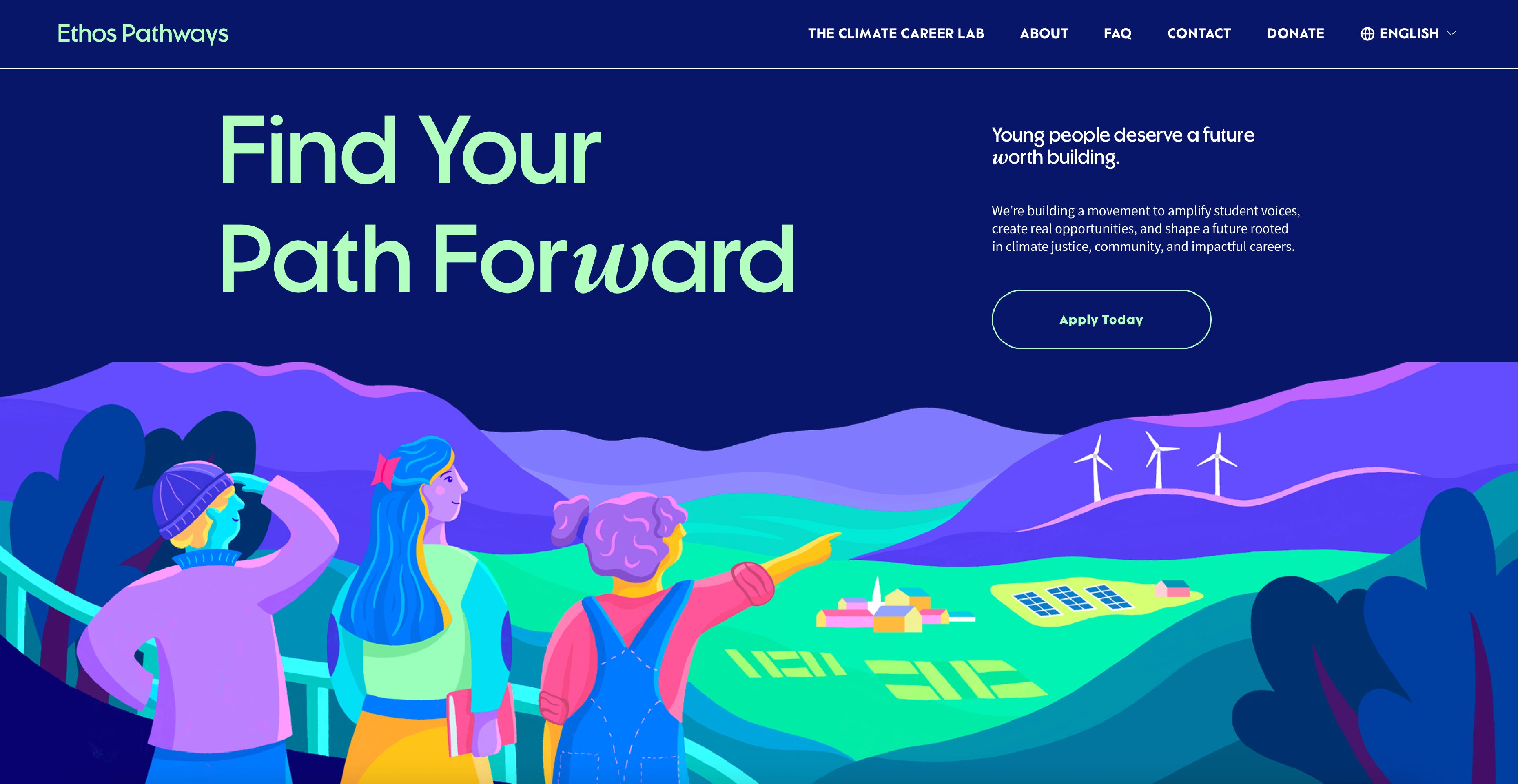
With the direction set, I began sketching character concepts. I wanted to answer: “who are these students? What are their backgrounds? What are their goals and dreams?” To make them come alive in our minds, we named the characters Paula, Sam, and Nathan — the first letter of their names corresponded to the names of the Berkshire counties. As each character’s story grew, it informed design details such as their fashion and accessory choices.


From concept to final
After we developed the characters, we then scoped out the designs for the four custom illustrations I would create — one feature image to serve as the homepage banner, and three supporting graphics.
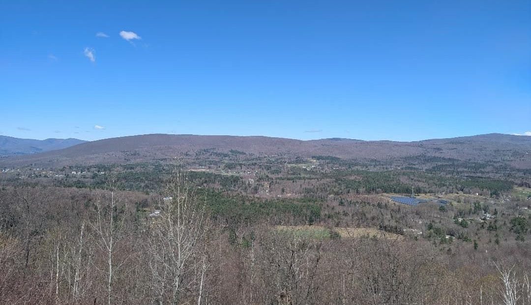
Since the feature image would serve as the first impression of the website, I wanted it to be engaging and hopefully a little inspiring too. Early on in my mood boards, we were drawn to the idea of the students imagining or moving towards a brighter, climate-conscious future. As we were brainstorming, Lani mentioned it would be cool if the illustration could give a nod to the Berkshires, and told us about an iconic viewpoint called the Hairpin Turn — a series of switchback roads offering sweeping views of the town of North Adams and the surrounding mountains. The concept clicked into place — we would station the characters at the top of the Hairpin Turn, looking out towards a greener future.
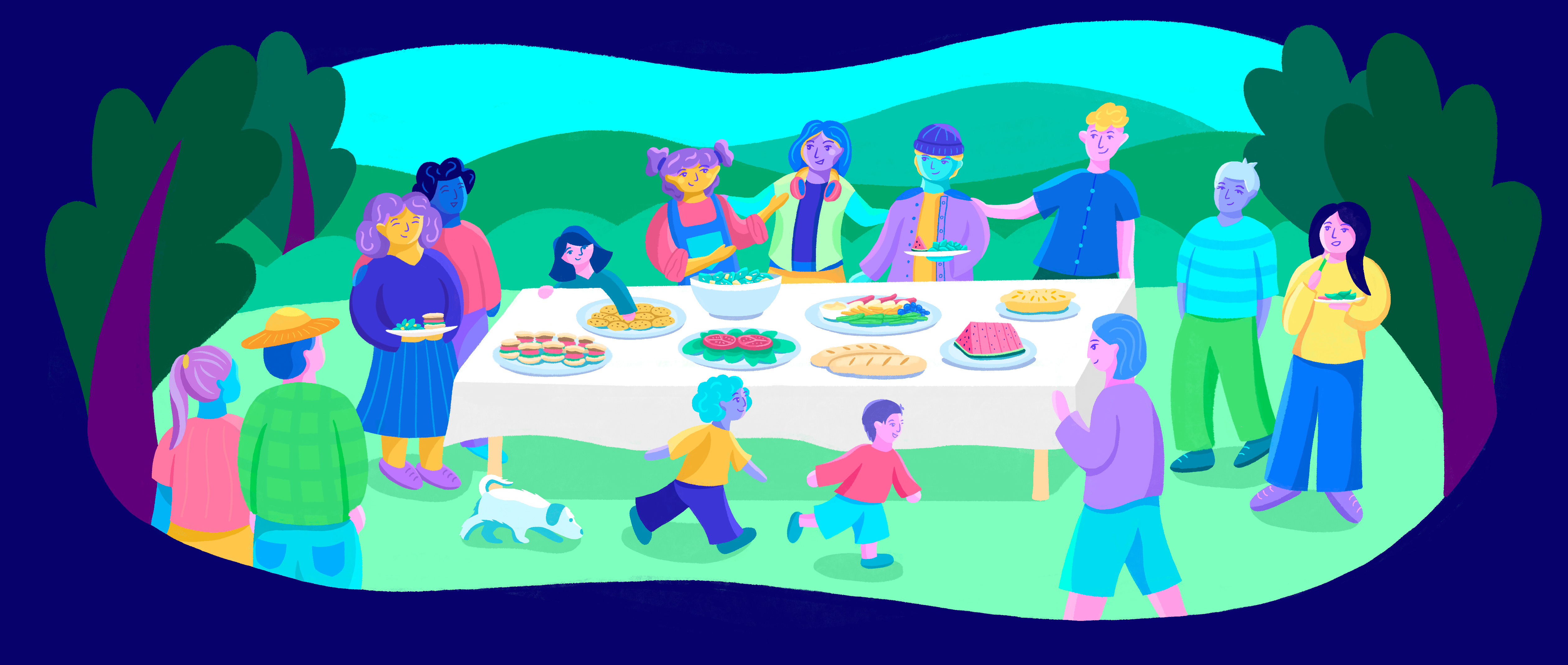
For the supporting graphics, we decided to highlight three aspects of the program to show our characters in action. The first image depicts the students learning in a class room setting; the second one shows the students going on a field trip to a local farm; and the last image focuses on community-oriented programming.


Once we nailed down the concepts, I dove into execution mode, turning my rough sketches into illustrations. In the final rendering, I decided to move away from line art and focus on bold shapes. Over the course of several weeks, I was merciless with myself when it came to the details — re-drawing and tweaking expressions, gestures, and shapes until I was satisfied. Soon, June arrived. After a final polish, I was done.


Reflections
This project will always have a special place in my heart. Collaborating with Lani and Hyde was truly a delightful experience, where we let our creativity and imagination run loose. Through our weekly conversations and feedback sessions, our collective brain melding led to breakthroughs and new ideas.
Looking back, I’m glad we spent quite a bit of time in the character design phase. Developing each student’s background, personality, and aesthetic was crucial to making them “feel real” and made drawing them in the final illustrations easier. The initial character design phase also prepared me for the final picnic image, where I illustrated eleven characters — the most I’ve ever drawn in a single image!
The truth is that when I start any illustration, I feel a sense of trepidation. Each time, I’m doing something that I haven’t quite done before, which can be scary. But that’s also the exciting part — that each project brings new subjects, new angles, new atmospheres to depict. And all I need to do is just follow my process, from ideation and sketching to rendering and refining. I love getting to the refining stage — when I start adding details, depth, and shading, that’s when I really start to see the piece come alive.
Thanks for reaching the end of this recap! I want to thank Lani for bringing me on this project and Hyde for his amazing creative direction. Also, special shoutout to Michelle Khare, whose Youtube series on tackling the Great World Race (running 7 marathons on 7 continents in 7 days) kept me company as I drew into the whee hours of the morning.
Inspiration Corner
I finished playing the cooperative videogame Split Fiction with my sister! I adore this game; it’s the kind of story I would like to write one day!
I was blown away by the American Repertory Theater’s production of the Black Swan.
And Les Mis is now my favorite musical ever.